

Home page carousels (or rotating banners) are a web designer’s darling, and are often demonized by Web usability experts because they take up valuable home page real estate, can be distracting and even detracting from conversion goals (in the case of the home page, a click rather than a bounce).
But user testing by the Baymard Institute supports the idea that users do like home page carousels (designers rejoice!) — provided they are implemented in a user-friendly way.
The following are 5 guidelines adapted from the Baymard Institute’s Home Page and Category Usability Report.
1. Users likely won’t see all slides, as they scroll on down, so beware of linking to important site features and offers only from carousel slides (e.g. product finder).
2. Because users are not likely to see every slide, your initial slide should be your most important slide.
3. Since an animated carousel quickly grabs attention, if it doesn’t reinforce the products you sell, your site’s flavor may not be inferred (example)
4. Auto-rotation is a good practice, provided slides don’t rotate too quickly (especially if they include text), and that slides pause when hovered over, and permanently pause when interacted with (clicked). Users can re-initiate rotation by clicking next/previous buttons, arrows or slide indicators.
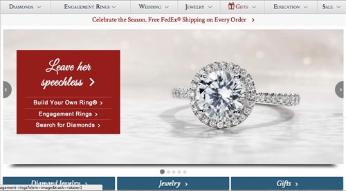
If my mouse is above this, then it should really pause [..],” a subject explained at Blue Nile, “because otherwise I risk clicking the wrong slide just as it changes, like it just did, and I’ll get the wrong page. So, pause.”
5. Slides should not rotate too slowly. Users aren’t very patient online, you know. Baymard Institute recommends 5-7 seconds for simple slides, and up to 10 seconds for text-heavy slides.
About the Home Page and Category Usability Report: Baymard Institute recruited 20 test subjects between the age range of 21–56, examining 19 of the largest e‐commerce websites following the “Think Aloud” protoco, including Amazon, Best Buy, Blue Nile, Chemist Direct, Drugstore.com, eBags, Gilt, GoOutdoors, H&M, IKEA, Macy’s, Newegg, Pixmania, Pottery Barn, REI, Tesco, Toys’R’Us and Zappos.
Image credit: CC by zigazou76